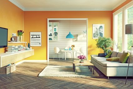


Interior designers consider grey the perfect colour. It is most often used as the background for highlighting and accentuating some parts of a space or its details. It is easily combined with other colours and some combinations are timeless, such as orange and grey, which are frequently found in the world of business and make an impression of exclusivity. Physics and psychology of colours qualify grey colour as cold, unemotional and conservative colour which has no particularly stimulative effect on people. It is solid and stable and gives the feeling of peace and safety. It is associated with maturity, intellect and knowledge, business professionalism and responsibility. This is why all shades of grey are frequently found in formal, office and business premises.
Grey colour does not have to boring
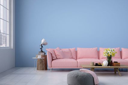
Interior design experts will always tell you that too much of grey colour in a room can cause melancholy and depression. If you use it inappropriately and on your own, you risk your home becoming an impersonal business-like environment or airport terminal. This is why grey colour is used as the background colour onto which you then add other, brighter colours, thus producing the desired effect. Lighter shades can replace very well, or even better, the white colour as background, and dark shades can replace the black respectively. When properly combined with other colours, grey becomes sophisticated, creative and inspiring. It has a calming effect on the surrounding colours and sooths the strength of bright ones. These are some of the basic rules how to combine grey with other colours, although rules exist to be broken, and grey colour completely permits you to do this. If you combine the lighter shades of grey with pastel shades of blue, pink, green and lavender, you create the so-called female principle. In order to produce a more masculine tone in a space, more intense shades of these colours should be used. However, if your space is dominated by darker shades of grey, see to it that the lighting is stronger and adequately positioned. Grey is also the colour of metal, silver, so by using it you can create the effect of high technology and industry. Vintage look can be achieved if you add bright pink details to the grey background. Grey has the power to cool down to a certain extent the so-called warm colours such as golden, yellow and red shades. Freshness and brightness can be achieved by using yellow details on a slightly darker grey background. Dove grey with lemon yellow is placed in the list of perfect combinations.
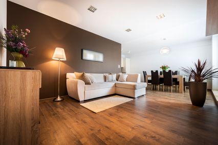
Apsolutno IN u poslednje vreme jeste moderan miks elegantne sive sa energičnom crvenom bojom, naročito u dnevnim sobama.
I još jedna veoma korisna informacija - siva veoma uspešno sakriva mrlje i nepravilnosti na zidnim površinama.
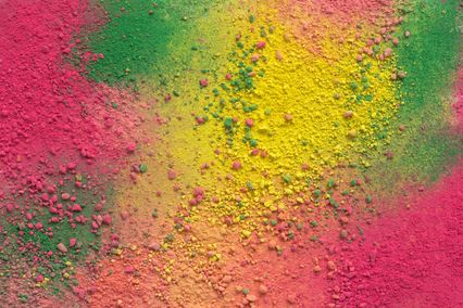
Ljudsko oko može razlikovati oko 500 nijansi sive, od tamne grafitne, slonove kože, preko golubije sive, srebrne i boje betona i kamena...
Ništa nije tako lično kao odabir boja za zidove prostora u kojem boravite. Zato vam predlažemo da upotrebite prednosti modernih tehnologija i pomoću naše aplikacije pronađete Vašu idealnu kombinaciju. Pogledajte kako određeni se tonovi sive uklapaju sa drugim bojama i sve to u prostorijama različite namene, pa i na zidovima Vašeg prostora.