


When we observe colours we can see that they differ in several ways. Some of them remind us of light, sun, warmth and these are warm colours. Yellow, red and orange belong to them. Red is the warmest colour in the spectrum, it is energetic, intense and attracts attention. Most designers will tell you that warm shades are those with the highest percentage of yellow or red. Warm colours in nature or interior create the impression that they are closer to the beholder.
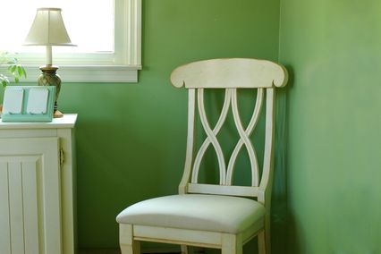
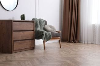
On the opposite side there are the colours resembling of water, sky and peace. These are blue, green and light shades of purple (lavender and lilac). To simplify, any colour which contains blue is cool colour. Deep shades of purple with a higher amount of red have more features of warm colours. Besides, any warm colour can achieve a cooler and less intense appearance by addition of white. When looking at walls or paintings dominated by cool colours, it seems that they are moving away from the beholder. There are also the so-called neutral colours which cannot be classified in any of these groups, and they are white, beige, grey and brown.
Warm or cool - balance is the key
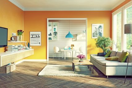
Interior designers often use features of warm or cool colours in order to produce a particular ambience in space. Also, good knowledge of colour features can assist in compensating certain imperfections and highlight advantages in a room. For that reason, if you are planning to decorate your living or work area, the best solution is to engage the team of experts. This also guarantees that, along with good quality materials and expert know-how, you will get a complete harmony of your desires, needs and financial possibilities. Nevertheless, it is useful if you yourself know some of the basic rules for using warm and cool shades on your walls. What is the most important thing to remember is that no room can exclusively have only warm or cool colours. They should always be combined, depending on the effect you wish to create. As in all decoration elements, balance or contrast are required.
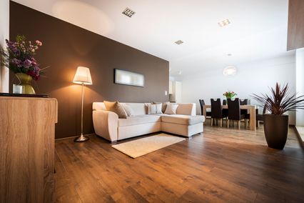
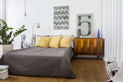
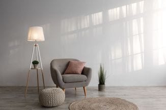
Warm colours as dominating will contribute to warmer and more intimate atmosphere of the interior. Warm shades are also suitable for larger rooms, which they visually make smaller and cosier. These colours are ideal for rooms that lack natural light and are directed towards the north. They are often found in dining rooms, kitchens and lager living rooms. Cool shades make smaller rooms seem visually larger, and sunny and warm rooms cooler, calmer and more pleasant. Cool shades will bring the necessary peace to rooms used for rest, such as bedrooms. They are recommended for spaces facing the south.
Finally, it is not so important whether you will choose one dominant colour and details in another one, or everything will be bursting with colours. It does not matter what colour scheme you are using. The ultimate goal is to achieve harmony and good rhythm of colours which suit your taste and temperament and to create the space where you will feel comfortable.