

Brown is an earthy colour which is frequently found in nature and symbolises strength, stability, warmth and comfort. Due to the warmth that its darker shades vibrate, it is considered the colour of autumn and winter. People often experience it as a natural, conventional and ground-to-earth colour although certain shades may seem highly sophisticated. It is used as a pleasant and more subtle substitute for black.
Brown also has associations to something which is edible, pleasant and tasty, so for many people this colour is the synonym for chocolate or coffee. Combined with green, it creates the timeless match of earthly colours with association to recycling and environment protection.
Brown is also the colour of simplicity. Its darker shades make the impression of gentility, wealth and comfort, such as chocolate and coffee shades, while softer and lighter shades (beige, coffee with cream, cappuccino...) are the ideal base for combinations with livelier and more intense tones. Interior designers simply adore the amount of creativity which the neutrality of brown shades provide, thus they are often found both in living and business environment.
Neutrality explosion of brown shades on the walls
Brown is often described as boring and monotonous colour without character. But this is true only if you do not know its real nature and fantastic possibilities of combining it with all other colours in the spectrum. By creative matching with other shades you will avoid conventionality and create different ambience in a space which will seem at the same time as the timeless vintage and modern style.
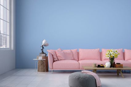
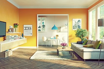
Intimate atmosphere and the effect of a sandy beach can be created by skilful combination of white and brown shades. This combination is an excellent choice for dining rooms and living rooms, as well as is the harmony which brown and orange colours provide in a space. Freshness and modern appearance in brown shades will be brought by light blue details while the female touch to the interior will be provided by the lovely lavender. It is not infrequent to find kitchens with these colours in top world interior design magazines.
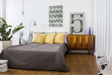
Classical look of a room can be created by combining red and brown. Since both colours are dark and absorb a lot of light, such design is recommended for well lighted rooms. Additional light can be provided by light grey and cream shades of walls and ceiling and exactly this powerful and unusual design is often found in men’s bedrooms.
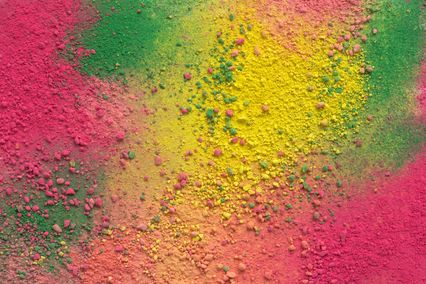
Warm and familiar effect is produced by combining brown and yellow, while white details will bring special light and cheerfulness to this combination. The old-fashioned look of brown colour on walls can be transformed by shades of purple and turquoise. By adding white, an elegant, modern and comfortable look of rooms will be created. Brown colour is ideal for combining, which is why we suggest you to play with Maxima shades of this colour and using our application create your own masterpiece on walls of different rooms. What is more, you can match it with all other Maxima shades from our wide offer using the photo of your rooms which you want to design.
When you find the winning combination, call our team of experts who will recommend adequate and good quality material and transform your idea into reality.