Yellow - fill the space with happiness and optimism

Yellow is the colour of sun, shine and brightness. It is the most stimulating colour of all which the human eyes first perceives. This is why in many countries taxis and school buses are painted in yellow. It is characterised by great wavelength and many of you will be surprised to hear that it is lighter than white.

Yellow is the “happiest” colour in the whole spectrum, it vibrates optimism and energy and attracts attention. This is why yellow is often used to give accent and highlight certain details and parts of rooms. This warm colour is symbolically associated with the sun and brings luck, self-confidence and even wisdom. It accelerates metabolism and breathing, raises blood pressure, improves awareness and communication. Have you ever asked yourself why mail boxes are traditionally yellow?

However, yellow has a negative side. If a room is too saturated with yellow and if you spend too much time in it, it can cause frustration, anger and fear. Some shades of yellow emit a large amount of light, so they make our eyes tired. For example, reading from the yellow background is the hardest, just for this reason. Research has shown that babies tend to cry longer and more often in rooms with yellow walls. That is why it is the best to consult the experts and leave the choice of adequate shades for a particular room to them. Also, they will know how to, by selecting good quality materials and proper combination of yellow shades with other colours, produce just the right effect which you want.

How to use advantages of yellow in the interior

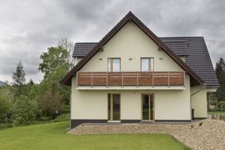
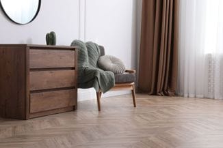
Since it belongs to the group of warm colours, yellow is ideal for rooms facing the north. On the other hand, the dynamics that yellow colour provokes does not make it appropriate for rooms used for rest and relaxation.

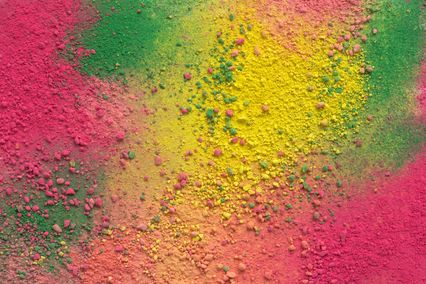
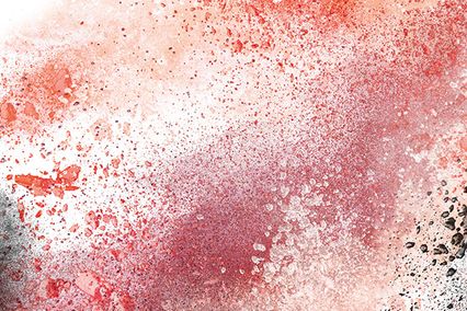
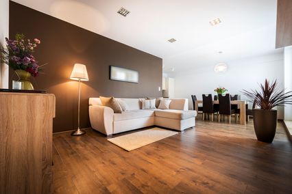
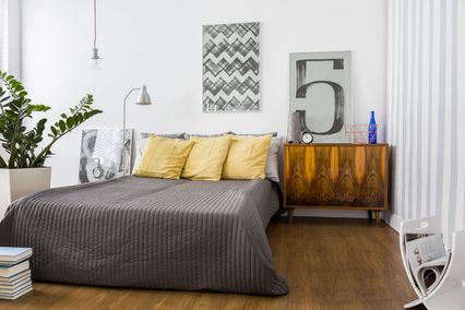
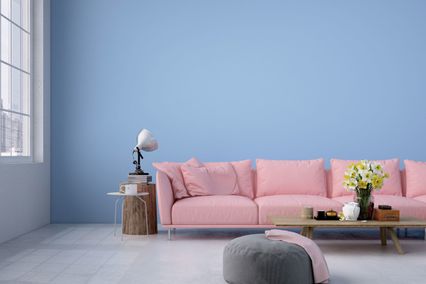
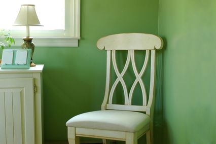
Yellow is not a good choice for bedrooms, at least not in its intense shades, but it is ideal for dining rooms and kitchens. Lemon yellow will make any kitchen look fresh and clean. By using different shades of yellow, many effects can be created. When combined with grey any room becomes elegant. Green and yellow adorably vibrate dynamics of a flower meadow. Pastel shades of yellow have a calming effect and create a pleasant and soft atmosphere in space. Intense yellow is perfect for accent and highlighting and it is best used for details. Banana yellow is a great match with black, grey or green. Red and yellow have, without fail, the association with hunger and boost the desire for food. We all immediately think of McDonald’s. Light and pastel yellow when combined with white, pastel purple and blue make an excellent combination.

In Japan, yellow indicates courage. Therefore, look at all Maxima shades of this interesting colour and bravely start to make your colour schemes. In order to help you decide more easily, we offer a very interesting ally - a modern application.

Play, match, decorate walls of different rooms… and in the end we give you the opportunity to do all of this on your own photograph of rooms and walls that you want to design.


Ostali saveti

From an Abandoned Factory to an Inspiration

Without doubt, artworks are considered to be elitist inaccessible valuables that are displayed in galleries and museu...

DOWNLOAD CENTAR.jpg

Art on the wall

Most experienced house painters will tell you something similar-painting or whitewashing means for them much more th...

Default alt text
pigmenti11.jpg

Color Pigments in Wall Paints (Toners)

There is no beauty without colors and colors speak all languages. Most of us surely agree with these two statements. ...

Default alt text
BRAON BOJA.jpg

Brown colour - enrich your space with the strength and...

Brown belongs to neutral secondary colours and is made by mixing red, green and blue (the ideal ratio is 56:43:23%). ...

Default alt text
bojanka.jpg

MAXIMA Coloring Book - Our Small Creative Gift

Coloring books for children have always been an effective tool that parents use to keep children busy and get some fr...

Default alt text
50 NIJANSI SIVE.jpg

50 shades of grey in your space, why not

Grey is a neutral colour, the colour of compromise. It is created by mixing white and black, the two so-called non-co...

Default alt text
TOPLE I HLADNE BOJE.jpg

Warm and cool colours in the interior

So far you have probably come across the classification of colours into warm and cool. You might know what colours be...

Default alt text
ZELENA BOJA.jpg

Green - colour your world in nature

Interior designers simply adore green colour. This is the reason why - green colour is neutral and goes well wit...