


Green is the symbol of nature, birth, cheerfulness and health. It is the colour of peace and balance. It lowers high blood pressure, calms down the nervous system, alleviates stress and tiredness, and some research have confirmed that it is beneficial for migraine and exhaustion. A room painted in green shades invites for welcome and has a calming and balancing effect. It is ideal for kitchens, bedrooms and bathrooms, and rooms used for relaxing and rest. Since green improves concentration and thinking, it is often dominant in work rooms and rooms used for learning. Green belongs to the group of cool colours, so designers recommend adding some details in warm colours (red and orange) to the room as the balance.
Green and other colours in the interior
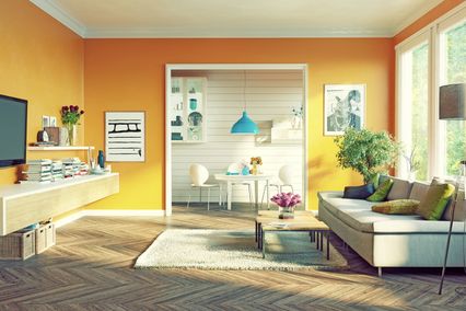
Green colour belongs to balanced colours and combined with others it easily provides the desired effect. There are several tried combinations that any interior designer would recommend to you.
Green
and black: the winning combination if you wish to create luxury and
elegance, especially if you use a deeper shade of green.
Green
and white: contribute to the impression of freshness and pleasantness
in space, while different shades of green open the door to creativity
and play.
Green
and yellow: a great choice especially for children’s rooms since
they evoke youth and vitality.
Green
and blue: they are an ideal match in nature, so that they will be
perfect, especially if you want to refresh and give a more “natural”
appearance to your home.
Green
and red: keep the spirit of holidays all year long, because this
combination unambiguously reminds us of Christmas and New Year
atmosphere.
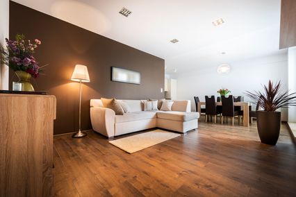
Green
and brown: gives warmth and the feeling of safety in a room - an
extremely pleasant combination which is often found in nature.
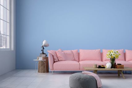
Green
and pink: a very frequent match of what seemingly cannot be matched.
By adding silver or golden shades, additional amount of glamour of
the space is achieved.
This is what you should also know about green shades
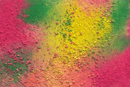
Green does not belong to primary colours, it is made by mixing blue and yellow. There is a huge number of various shades ranging from the lightest to deepest ones. Sophisticated look is created by shades of sage and yellow-green. It would be the best to complement light green walls with furniture of light shades, while darker shades should be matched with blue and turquoise pieces of furniture and accessories. Pastel shades of green are an excellent background for furniture made of natural materials such as linen, wood, wattle or jute. Recently, Guilford green has been the real success among designers, a pleasant shade made by mixing brown and grey. If you are the fan of Feng Shui in interior design, mint green is unavoidable in kitchens. Striking and spectacular emerald green is perfect for accent in the interior. It is close to turquoise-green shades, but it is regarded as more elegant and classy. You can tone it into a more expressive or pastel shade and adjust it to any room.
You have definitely decided that you want green on the walls. But what shade and how to match it with other colours? Our application will help you find the answer. Let your imagination run wild and see how your interior would look in many different combinations of Maxima colours. And, of course, call the team of experts to bring it to existence.