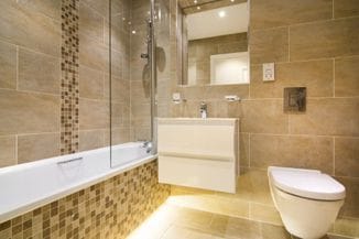


On the other hand, there are so many colours and their shades. And even more possibilities for their combining. How many colours to use so that we achieve a pleasant harmony in space? How to compose them and avoid the impression of monotony or, even worse, bad taste and chaotic display of colours? Planning the winning combination of colours begins with research and understanding the properties of colours and their relations. The basic tool for colour combining is the colour wheel with 12 colours. The colours around the colour wheel are divided into cool and warm colours, primary, secondary, tertiary and neutral colours. Also, they can be dark or light. Good knowledge of these properties can help us create the desired ambience, highlight advantages and alleviate disadvantages of a particular space.
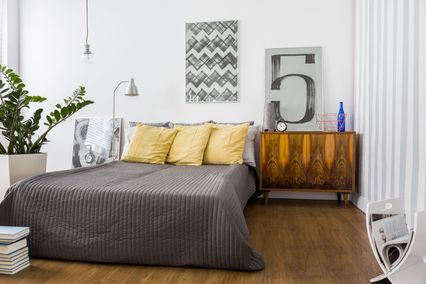
One of the basic rules is not to combine more than three colours. There are several established and proven principles of their combining and one of them is the analogous colour scheme.
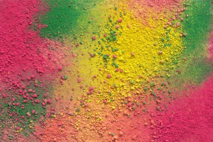
Analogue colours for harmony and comfort
Analogous
colour scheme represents combination of three (or possibly two)
colours which are adjacent to each other on the colour wheel.
Analogous shades have a very good harmony and by using them a
harmonious and comfortable ambience is achieved. The
recommendation of interior designers is to use the analogous
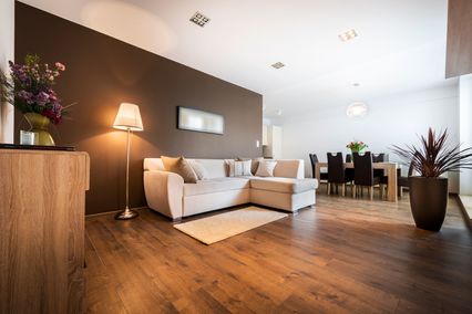
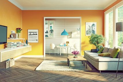
principles of combining warm and cool colours. For example, for a
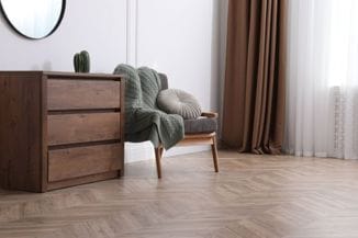
room the ideal combination is to use red, orange and yellow colours.
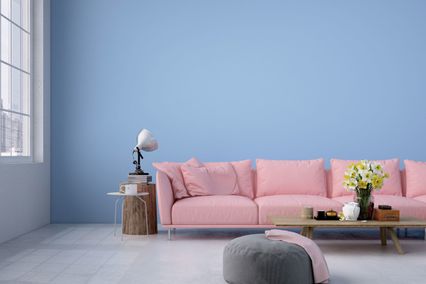
It creates the ambience of exquisite warmth and cosiness. Purple,
blue and green create a cooler and reduced effect which is ideal for
rooms used for rest and relaxing. In
order to avoid inharmonious colours in a space, one colour should be
used as a dominant one and the largest area of the space should be
painted in it. Out of the other two analogous colours one will be
used as the secondary colour and the other as the accent colour for
details. Such
a combination of colours is frequently found in nature and this is
why it is extremely pleasant to the human eye. The best example of
the analogous colour scheme is the analogous gradation of the leaves
in autumn.
In art one of the examples of the analogous combination of
colours is Van Gogh's painting „The Sunflowers“.
Although the analogous colour scheme seems harmonious and well-balanced, the lack of greater contrast may represent a disadvantage. Of course, there are different ways how to achieve a higher contrast in the analogous combination of colours.
In the end, you do not need to know anything about colours and principles of their combination in the interior. In order to achieve exactly what you want in your space, the best thing is to leave everything related to planning, selection of appropriate material and its application to the team of experts. The only thing which is up to you is to make a wish, provide an initial idea and the experts will see to it to transform your idea into a real masterpiece on your walls in the shortest possible period.