


In
the story about colours and their combinations everything begins from
the wheel with 12 colours - 3 primary, 3 secondary and 6 tertiary
colours. Colours of the spectrum can be warm, cool, dark and light.
There are no neutral colours in the wheel such as white, black, grey,
beige and brown. The
colours in the wheel have various relationships and different colour
schemes have been created on this basis.
One
of the simple schemes is the complementary or contrast colour scheme.
In accordance with this principle two colours which are opposite each
other on the colour wheel are combined in a space.
These two colours
are in natural harmony, so they complement and highlight each other,
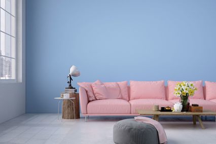
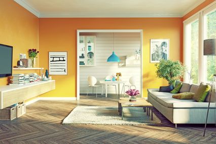
such as red and green, yellow and purple, blue and orange.
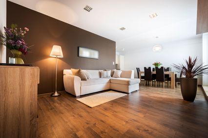
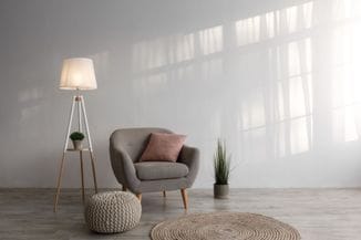
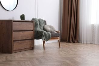
Use dynamics of contract in your inerior
The result obtained by combination of two contrasting colours can be very interesting. In this way we actually combine warm and cool shades, by which extreme liveliness and dynamics in a space is achieved. Still, we should use them in smaller amounts and, depending on the desired effect, use one colour as the dominant and the other for accent. Cool and less intense colour is most often used for the background and pure, warm colour for details. By using complementary colours you can more easily attract attention and highlight a particular segment or detail in interior decoration.
If you use both colours in pure shade, this scheme is highly vibrant, almost “screaming” from your walls and can create the feeling of unease. For example, by combining red and green you create the intense atmosphere, such as the one of New Year holidays which never end.
Due to its intensity, interior designers always decide to combine muted shades that create a much more pleasant environment. There is an infinite number of various mixtures of shades and tones by adding black or white colours to them.
A less pronounced contrast can be achieved by using split-complimentary colour scheme. It uses one basic and two (analogous) colours opposite it. By this scheme the visual balance and harmonious environment are more easily achieved and the neutrality soothes the space. Complimentary colour scheme is applicable to any space, especially to children’s, living and dining rooms. Contrasting colours complement in space but when mixed they neutralise each other. Mixture of any two complementary shades is neutral. Infinite number of complimentary colour combinations may seem confusing, especially for those who are can’t make up their mind. This means that you have an infinite number of possibilities to make a mistake as well. In this case the safest solution is the team of experts with tried, good quality materials and colours. What is yours is just to enjoy the colours of your home or work environment.