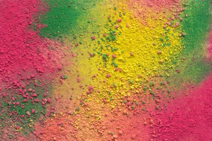


It makes the oxygen flow faster through the brain and improves concentration and learning. Orange is the only colour which was named after the fruit, orange. It is always trendy and up-to-date, especially since the „Forbes magazine” proclaimed it to be very influential in marketing. There are lighter and darker shades of orange depending on the presence of yellow or red: terracotta, saffron, pumpkin, melon, apricot, peach, powder...
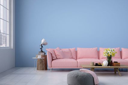
In interior decoration orange is suitable for rooms of any use, on condition that you use an adequate shade. Since it is intense and very warm, orange is not recommended as the dominant colour but to be properly combined with other colours.
Orange is the real example of the basic designers' rule: there are no bad colours, there is only their bad (inadequate) combination.
How to make the orange on your walls shine in full splendour
Orange leaves enough room for creative playing with its shades in the interior and for producing various effects. If a shade is skilfully selected, this colour may be used in any room, notwithstanding its function. However, you should have in mind that orange is extremely warm and visually reduces space. This is why it should be combined with cooler tones and used in well lighted rooms.
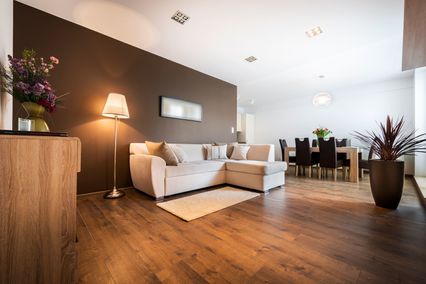
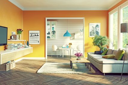
Psychologists point out the extremely positive effect of orange on concentration, learning and personality development. Therefore, it is ideal colour for decorating children’s rooms and business offices. Particularly fashionable is the match of blue and orange which gives a harmonious but authentic appearance of a children’s room. Orange initiates communication, relieves nervousness, which makes it the perfect choice for the rooms where more people spend time together and which are used for socialising and celebrations, such as the living room. This playful and energetic colour stimulates activity, so designers recommend it for gyms and exercise rooms.
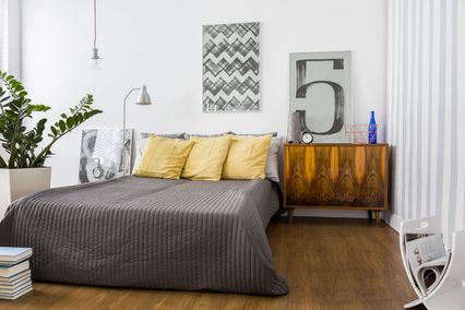
More intense shades of orange should be avoided in bedrooms, because, though not so passionate and aggressive as red, it can disturb sleep and cause anxiety. On the other hand, in the kitchen, orange is more than welcome, but only if you do not follow a particular diet. Orange causes a great desire for food and improves the appetite, which is often used by restaurant and bar owners. Details, kitchen elements or counters coloured in vibrant orange have been a huge hit lately.
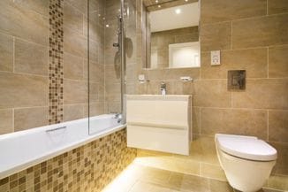
Warm and pleasant welcome can be achieved by colouring the walls of your hallway or some areas of the space in soft shades of orange, such as peach, apricot, skin or salmon. Intensive and lively citrus shades of orange present in details or some areas of the space will revitalize your environment and give it youthful energy. Deeper shades of pumpkin and amber bring additional warmth and comfort. You will surely make no mistake if you combine orange with white which will provide the necessary light to the space. Attractive, sophisticated and elegant look of the space is provided by a little unusual combination with purple, which can also be complemented with white details. Brown shades with orange will ensure warm and cosy atmosphere, ideal for living rooms and bedrooms and for dining rooms as well. Orange is an excellent choice to “break” the monotony of grey, and with green you will create an utterly fresh and modern look of your bathroom space. And finally, for a magical and exotic, mysterious and warm ambience, combine it bravely with black and you will definitely have “in” interior at the latest fashion.
How all this would look with Maxima shades of orange in specific rooms and even on your walls which you wish to design, you can see using our application. And in order to produce the selected effect, the best thing is to consult our acknowledged team of experts.