
Almost 75% of teenagers say that purple is their favourite colour. It was the favourite colour of the Egyptian Queen Cleopatra. It was also very inspiring for the famous composer Richard Wagner, who composed his operas in the purple room. Today it is regarded as the colour of Masonry and royalty which symbolises prestige, power, ambition, wealth and extravagance. Purple is also associated with wisdom, dignity, creativity, magic and mysteriousness. It is closely related to spiritualism, which is why it is recommended to paint the room for mediation in purple shades.
Psychology claims that purple has an exceptionally positive effect on development of children’s imagination from the early days and that is why it is often used for decorating children’s rooms and products for children in general.
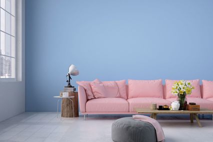
Purple is unique in one more way: as no other colour it can be cool or warm, depending on the amount of blue or red in it. This interesting colour can be intense and vibrating or pastel and neutral, which means that using purple you can create various effects in the interior. A more spiritual and calmer or warmer and energetic environment, all of them can be achieved by combining purple shades. And finally, purple shades can be mutually combined. All this makes it the favourite colour of many interior designers.
Unspoken rules for purple walls
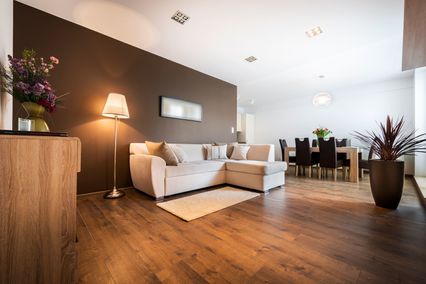
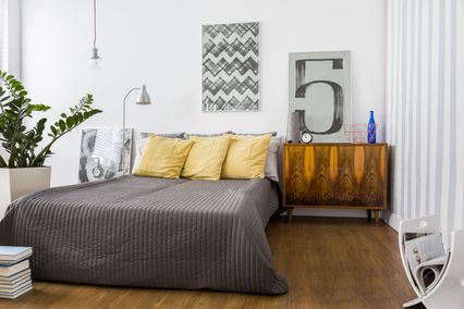
Purple is an appropriate choice for rooms of any use, ranging from bedrooms, living rooms to bathrooms and business offices. According to Feng Shui purple has a strong energy so it should be used carefully, especially its pure shades.
One of the unspoken rules for purple colour on your walls is the same which applies for golden shades - too much of it is the sign of bad taste and kitsch. That is why it would be the best to seek advice and leave the decoration job to experienced experts. If you do not want to make any mistakes with purple, use it to highlight and accentuate details. It does not mean at all that you cannot paint the whole space in purple as the dominant colour. But, in this case you should take lighter shades, such as lilac or hyacinth. Rich shades of purple such as grape or plum are best used to paint one wall. Bathroom is the ideal place for creative playing with all shades of purple, so that you can combine its lighter and more intense shades. The elegant and luxurious effect is created by combining purple with black, and if matched with the energetic red it has a completely lavish look. Satin white with light shades of purple is an excellent suggestion for decoration of a girl’s room. An interior decorated in purple shades with addition of light green and pink shades has a warm and soft look, with a touch of female principle.
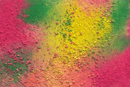
One more fact makes this colour utterly interesting. Purple and yellow colours annul each other or neutralise. When mixed, the neutral light white colour is created. Give it a go!
And
we also suggest you to try one more thing.
If
you also wish to have the royal colour in your space, check the
Maxima purple shades and use our application for virtual decoration
of walls in different rooms.
Modern
technology provides you with the possibility to simply upload the
photograph of the room which you wish to decorate and then combine
different shades from the wide Maxima colour palette until you find
your perfect purple colour scheme.