


Too few colours and the space looks boring and monotonous. Too many colours and the visitors will leave the room in a hurry “attacked” by the chaotic display of colours. Visual balance and harmony are what we strive to achieve in colour composition. But, how do we achieve this in the interior?
All the magic of the winning colour scheme starts from the colour wheel consisting of 12 colours. There are 3 primary, 3 secondary and 6 tertiary colours arranged around a circle in the specific order. As far back as in school days we were taught that colours can be warm and cool, dark and light.
At first glance we can see that there are no black and white colours on the wheel, because these colours don’t exist in the sun spectrum. Also there is no grey which is made by mixing the previous two. These are the so-called achromatic or neutral colours. Each group and each colour can individually be used to produce a certain effect, to highlight advantages and hide particular defects in space.
By using the colour wheel as the basis and by knowing the colour features and their mutual relationships you can find the successful colour scheme for your walls. In interior design there are several mathematically accurate colour schemes for colour combination which surely give a pleasurable and balanced effect to the space. Monochromatic colour scheme is the simplest of all and uses only one colour repeated at different intensity and lightness.
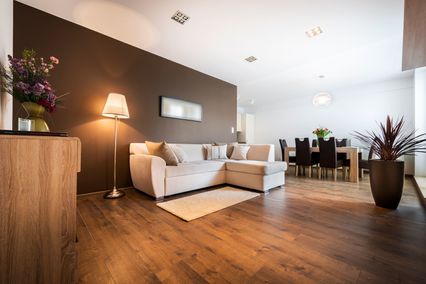
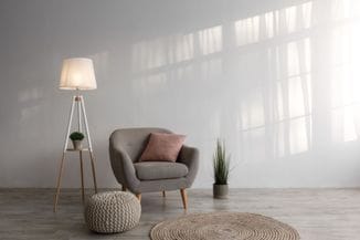
Various faces of one colour on the walls
Colour
scheme which includes only one colour in different saturation
variations and lightness is the so-called monochromatic colour scheme
for the interior. Although
based on using only one colour, this colour scheme can be highly
interesting and varied. In
order to avoid monotony, using contrast is recommended. The most
pronounced contrast among colours is the one between black and white.
By adding these colours to any other colour you create different
values, i.e. their dark and light shades and tones. You should have
in mind that the surrounding colours will affect how much a colour
looks light or dark. Monochromatic
colour scheme can be successfully used in decoration of any kind of
space, used either for living or business. Still, this colour scheme
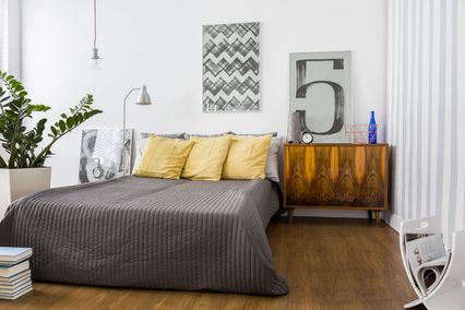
is most often used for decoration of living rooms and bedrooms. The
only thing needed is to use an appropriate colour which is in harmony
with the ambience you wish to create. When
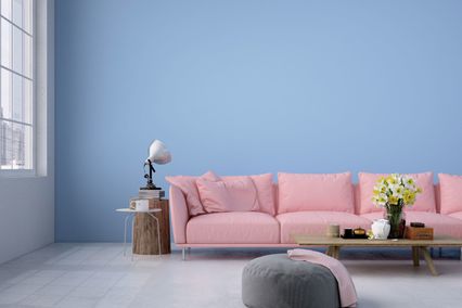
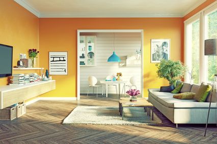
selecting the colours you should also have in mind that colours have
a huge physical and psychological impact on people. This means that
warm colours are ideal for larger rooms, directed towards north,
giving them a more intimate and softer appearance. Cold colours
visually expand the space and produce the feeling of calmness. If
you choose green and combine its several lighter and darker shades,
you will create a provocative and, at the same time, relaxing
ambience.
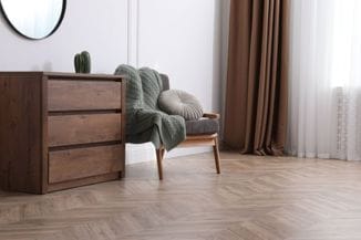
Monotony
can be avoided if you apply the colour on the walls of different
texture. In this way, even with the monochromatic colour scheme, you
can create powerful and dramatic effects in rooms.
If
combining colours still seems complicated to you and you don’t want
to risk the final result, the best option is to address the
professionals. By using materials of good quality and expertly
conducted operations, you can also have the interior like those on
the cover page of a magazine without much stress.