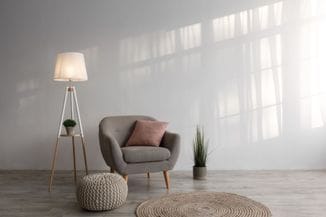


Since it is one of the lightest colours, it reflects light and makes any space visually larger than it actually is. Still, if white is used as the dominant colour, a room may seem sterile and impersonal. This is why interior designers, instead of pure, snow-white tones, recommend off-white ones. By adding other colours to white, a range of interesting shades is produced that are very popular among interior designers and architects. The most famous shades of white are ivory, pearl white, satin, seashell, linen, old lace and baby powder… These off-white colours will give authenticity and brightness to any space and they won’t go unnoticed, because white is excellent as a background for highlighting details.
Classical style in a different way
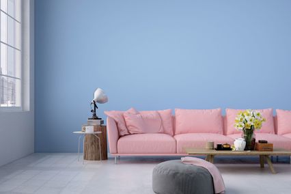
If you like open spaces, bright and with no excessive details, shades of white are the excellent choice for your walls. However, you have to be aware that any imperfection or impurity is much more visible on white walls than it is the case with other colours. This can be, to some extent, avoided by using toned, off-white shades. Off-white shades are inexhaustible source of inspiration for all creative people who like to play with different ambience. They are always the safe and unmistakable choice if you can’t make up your mind, because you almost can’t go wrong with white. They suit to every space, both large and small, they are neutral but lavish at the same time. White shades are most often used for ceilings and narrow and smaller hallways as well.
If
you decide to paint the whole room in white, especially in more
shades of white colour, try to match similar shades. One of the very
frequent errors is combination of warm and col shades (for example
vanilla and ice white), because warm shades look dirty in comparison
with cool ones. Details
in any other colour, dark, intense and bright or gentle and pastel
along with off-white background will produce three-dimensional feel
and personal touch to any surface. White shades can bear a great
number of details without creating a messy and gaudy effect. For
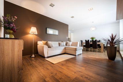
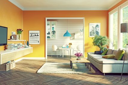
a kitchen, combination of off-white shades with blue and green tones
(pistachio or green apple) looks extremely modern and refreshing. Ivory
is very sophisticated, it brings the feeling of serenity and warmth
in any room and goes well with warm colours such as brown, beige and
deep yellow. Ivory produces translucent and pleasant atmosphere,
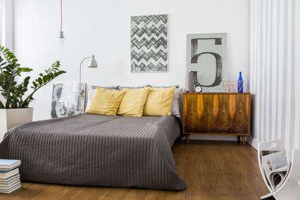
which makes it ideal colour for living rooms and bedrooms. A livelier
and more energetic ambience can be created by combining it with green
and red shades. A room painted in ivory with black details gives off
special glamour and luxury. And
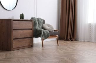
finally, all off-white shades have a more than interesting, even
avant-garde, look on rougher textures, such as brick or stone walls
are. Use
white shades and create ambience that is always trendy and exactly
like those found in top world magazines.
Play
with combinations of off-white shades with other Maxima colours using
our application and find out the ideal design for your room - simply upload the photograph of the room you want to decorate and let
yourself go with the infinite number of combinations.