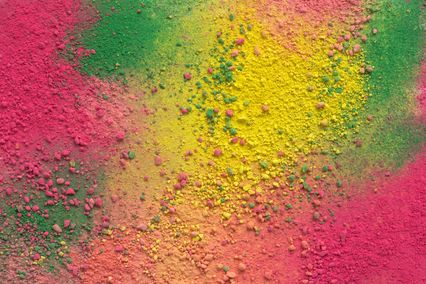


But, how do we match all these colours in order to create the desired ambience, where we will feel comfortable? Combining colours is one of the most important elements of the theory of colours and interior decorating with colours. At the same time it is one of the first questions that appears when we start redecorating the space. Basic combining of colours begins from the colour wheel, i.e. the colour spectrum arranged in a circle. The most frequently found variation is the wheel with 12 colours. Within the spectrum we can differentiate primary, secondary and tertiary colours. As we know, we can combine them using some established and tried systems and with regard to the effect we wish to produce.
60-30-10% color decorating rule
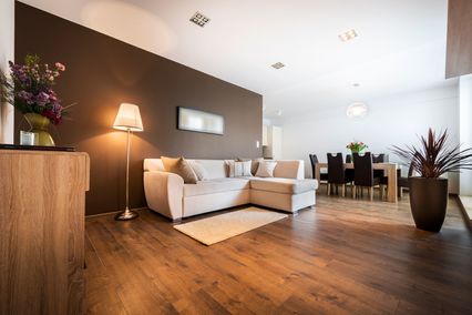
The basic designer rule for the ratio of colours in a space is 60-30-10% decorating rule. If you follow it, you certainly will not make a mistake and you will achieve the balanced appearance of your interior.
Translated
to interior decorating this means that 60% is the colour for the
walls, 30% makes the colour of furniture, shelves, curtains, carpets,
etc. and 10% is for the colour of details such as paintings,
cushions, lamps and other decoration accessories. You
can choose colour scheme following either the rule of contrast or
harmony. The most important is that they match. Prior to this, you
should become acquainted with the major properties of colours and
their impact and effect which can be achieved by combining them. The
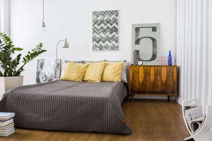
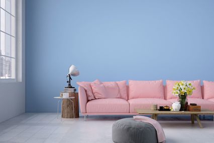
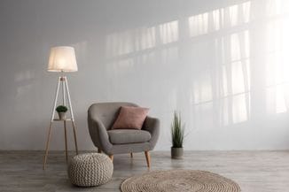
basic classification is into warm and cool, dark and light shades. For
all three colours you can use various shades of the same colour, but
they can also be completely different. Shown
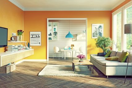
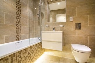
on an actual example it looks like this: dominant colour in the
living room is most often some shade of brown, beige, grey or white.
This certainly can be any colour that you like so much that you use
it to paint the most of the space. Secondary
colour can also be one of your favourites which is complementary with
the dominant one. If the white is the dominant colour, the ideal
secondary colour might be grey or black. Accent
colour is used for highlighting and to give an authentic impression
to the space. What is mostly used are bright, intense colours,
although, depending on the previous two colours, it can be a neutral,
pastel shade.
With the dominant white, secondary grey or black, the
effective accent colour might be the intense red.
And here is how to break the rule
Rules exist to be broken. This applies to life and to interior decorating as well. But, in order to avoid a rule, you have to know it well. If you are a rebel by nature or you perceive balance in a little bit different way, you can always make your own rules. For example, you can experiment with proportions 30-30-20-20% if this gives good results and the necessary balance to your space. Or try out the 110% formula. Simply, instead of one, choose two bright accent colours. It is quite enough to get the effect and be authentic enough.
If all this still sounds too complicated or is not the field of your interest, but you want to decorate the space with good quality and taste, you can always engage the team of experts. Your desires and possibilites with the materials of acknowledged quality and experts who will design and conduct everything make the tried formula.