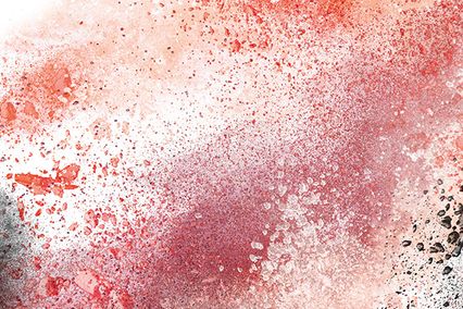


In interior design it is used as a supporting, accentuating colour which emphasizes something special. Also, red is an excellent way to make a special and striking impression.
In psychology red symbolises love, strength, energy, wealth, excitement, speed, danger, action and spite. While its darker shades remind you of dignity and seriousness, lighter shades reflect optimism, elegance and charm. Red colour has a strong effect, encourages action and speeds up the pulse, breathing and appetite. In interior decoration red is rarely the dominant colour and it is recommended to use it moderately and only in accordance with the instructions of professional interior decorators. It is mostly used to highlight a particular area of the room or emphasize the details in it, otherwise it can cause negative effects such as nervousness, irritation and even headaches.
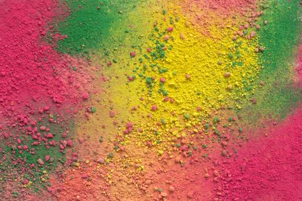
Red shades in the interior
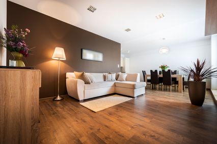
If you follow certain rules, red colour can significantly improve the energy and mood in a space. The experts recommend to paint in red walls of the rooms where you with to encourage activity, creativity and productivity. Red colour should not be the choice for rooms where you intend to have a rest, peace and quiet. It is not recommended for bedrooms, since it is stimulative and not good for sleeping. Still, some details in soft shades of red (by no means its pure shades) will contribute to creation of romance, sensuality and luxury. This powerful colour is an excellent way to achieve authenticity, especially in dining rooms. It energy is very often transferred to the living room, which the dining room is often connected with in majority of homes. Ruby or wine red make the impression of traditionalism and power, while its warmer shades such as vermilion red provide additional warmth.
Since it has a stimulative effect on appetite, red is perfect for decorating kitchens and dining rooms. However, here also you should be moderate so try to avoid having all walls in red shades, because you can create the impression of excessive heat. The most effective solution is to use this charismatic colour for accentuating details.
Red colour can significantly contribute to productivity and work creativity. This is why it is frequently recommended by interior designers for business offices, especially for those of smaller size, since it contributes to ease and comfort. Lively, vital, red tones such as poppy or cherry are the unavoidable part of decoration of children’s rooms and rooms for teenagers to whom authentic expression is very important.
Red encourages buyers to action
Red details in offices or in some other business environment will contribute to productivity and working atmosphere. The advantages of red colour and its effect on people’s behaviour are very often used by owners of hospitality facilities, restaurants and kitchens. It is well-known that red causes the desire for food.
In sales facilities red shades can create the feeling of urgency and encourage the customers to buy more. Red highlights and emphasizes and also “urges” to action, which is buying. Rose, crimson, coral, wine red or terracotta, Venetian red or scarlet red... for some shades you must have heard, for some you have not. In order to use in a proper manner all the advantages of this colour in your interior, we suggest you to consult experts. What you can do yourself is to use our application and your own creativity in order to see how some red shades look on the walls of rooms with different use and how they match with other colours. And the special treat - you can upload the photographs of your rooms and try out all the shades of red and combine them with other colours from our wide offer.