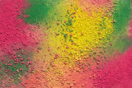


First, we have a great number of colours and their hues at our disposal and an infinite number of their combinations. Tastes are different, so that the beauty of an interior is in the eye of the beholder. And we would like to add that taste is not for discussion... Too little colours - monotony, too many colours - chaos with the feeling of kitsch. And we know that what we are looking for is harmony. There are quite enough reasons to get a headache when you only think of it. Fortunately, there are some simple rules for selecting a colour scheme which always gives good result.
One of the mathematically accurate ways to match the colours in your space and create a balanced ambience is to use the triadic colour scheme principle. All that you need is the simple colour wheel or circular palette with 12 colours and a triangle of equal sides (equilateral triangle). And so the magic begins…
What are triadic colours?
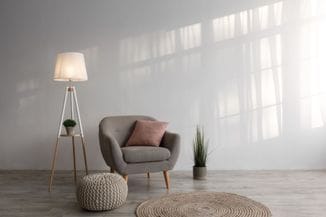
One of the generally accepted rules is that three-colour scheme is the best scheme for interior decoration. But which three colours? How to find the best combination? Here you should have the basic knowledge about the colour wheel and the basic classification of colours. All colours are classified into primary, secondary and tertiary and then into cool and warm colours, and finally into light and dark ones. Each of them can be used for producing a certain effect and hiding some imperfections in a space. For example, a narrow and dark space painted in blue will be visually expanded and provide more light.
When we look at the colours arranged around the circle, we can select the colours that match well in space by using precise mathematical methods. If we imagine a triangle of equal sides in this circle, we get triadic colours.
Triadic
colours are equally spaced around the colour wheel. In the wheel with
12 colours this is every fourth colour. In this way we can get 4
different colour schemes:
• Triadic
scheme of primary colours: yellow, red and blue
• Triadic
scheme of secondary colours: green, purple and orange
• Triadic
scheme of tertiary colours: yellow/orange, red/purple and blue/green
• Triadic
scheme of tertiary colours: yellow/green, red/orange and blue/purple
White
and black are added to these colours to produce lighter or darker
shades.
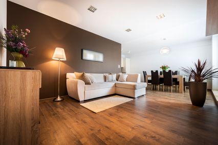
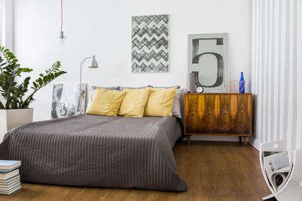
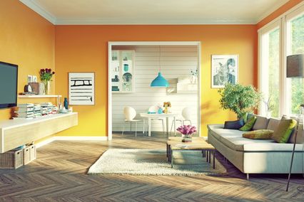
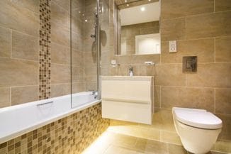
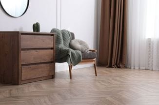
Tasteful and balanced colourful scheme in your space
Colours
are an extremely powerful tool for creating a specific ambience in
interior. By combining colours using the triadic principle we get
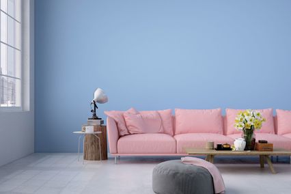
lively and cheerful space which is the most suitable for children’s
rooms. Triadic scheme of warm colours is very intense and can cause
the feeling of discomfort in the room if you paint the equal amount
of space with each colour. Liveliness
and intensity can be soothed by using one colour as the dominant, and
the other two as the secondary and the accent ones. Simply place the
tip of the triangle on the favourite or desired colour and the other
two tips will point the two other colours with which we will create
the ideal picture of our space. Besides
this, there are more important details that we need to pay attention
to when selecting the colour scheme. Except the desired ambience, we
have to consider the use, lighting, size, direction… Interior
design can be a very stressful job. There are so many things to know
and, what’s more important, to apply.
Moreover,
there are so many producers of interior decoration materials at the
market and the question is how to choose those of good quality and in
line with our desires and financial possibilities. Our suggestion is
to address the team of experts that will, using the materials
produced by the latest technology, real knowledge and long
experience, fully accomplish your ideas.